TEch
Fast, Faster, Living-Times Magazine: How Pre-Fetching Has Reduced Our Loading Times
Have you ever wondered what a Livingdocs website looks like? The answer is easy: as you wish! Livingdocs is a headless CMS, so the frontend is provided by you — and thus 100% customizable. To get an overview about the versatility of Livingdocs, you can always check out some of the different website from our customers: NZZ Newspaper, NZZ Folio, SZ Magazin, Bluewin.ch, Swisscom TV, Luxembourg Times, or Main-Post. Or you can check out our own Magazine example: the Living Times.
The Living Times is an open-source Magazine that can be found on github, whose content is entirely created with Livingdocs. As the Magazine is extremely content-rich, we faced the problem of long loading-times in the past. However our engineers have come up with a solution that optimizes the user experience immensely. We are trying to not get too technical here (the technical deep-dive can be found at the end of the article), but want to describe one of the features that make this Magazine unbelievably fast.


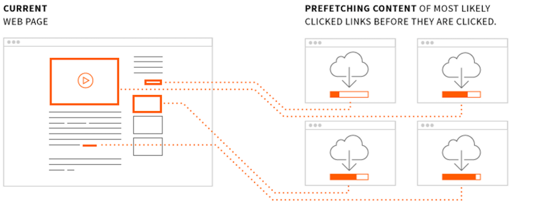
The feature is called “pre-fetching”. Once the user decides he wants to read another article or switch to another topic such as going from Politics to Technology — the website will notice the user hovering above the Technology”-link and will already start downloading the key-data needed in order to display the page in the background.
That means once the user is ready and clicks the link to “Technology”, he will already have downloaded all the necessary page-content and it can instantly be displayed. This makes up for an insanely great user-experience and keeps the user on the page longer as browsing does not take away his time. For the curious among you, Google has a similar approach in their AMP project, and you can learn more about it here.
Quick loading times are especially important for users on a mobile device, because — as a matter of fact — users will quickly turn away if a page loads too slow. According to Google, a stunning 53% will leave the website if it needs longer than 3 seconds to load.
You can see the re-vamped Magazine in action for yourself here.
The technical deep-dive
Our customers have a high demand for website-loading-speed or data-volume used on mobile devices. That’s why we decided to work with a new technology to optimize the user experience on our Magazine. Also keeping the developer-costs in mind, we have also simplified our current solution for easier use. The result: The Magazine now feels like a single-page-application (SPA).
How did we get there?
The new open source Magazine functions with two core, modern web technologies. One is gatsby.js — a static progressive web app generator and the other one is react, which gatsby.js builds upon. All of the magic starts with the plugin: gatsby-source-livingdocs — this will fetch all the data from Livingdocs. Once you have your data, you create different pages for your various content-types and generate them all during build time.
This means once you deploy the progressive web app, pre-build pages are delivered instantly to the users versus waiting for the pages to generate first. This comes with the benefit of super efficient pre-fetching. Since you don’t need to load huge bundles for different routes and most of the pages are identical, the article content will be delivered as a very small json once you hover over a new article. Once the user actually goes onto that article, pictures or larger files will be fetched from a CDN.
As the Magazine is built on top of gatsby.js & react, it serves as a very comprehensible example to understand how you can use Livingdocs for your use-case. As gatsby.js builds all the static files, this can be easily deployed on dozens of services. As the data is recursively fetched from the server, you could potentially handle thousands of articles for a blog or small Magazine with this example. (For publishers with millions of articles, we offer some different solutions).
Check out the github repository for the Living Times Magazine here.
